10 Famous Logos That Have A Hidden Message
Did you know that amongst some of the most famous brand logos are little hidden messages? A lot of these you could probably see on first glance but others you would have to look a little harder. Logos are more than just cool little designs. In this article, we’ll show you some of the most famous and recognizable brand logos in the world and the hidden messages buried in them Here are 10 logos that you see almost every day and what they represent.
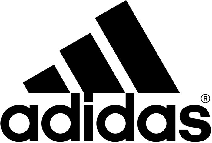
1. Adidas
Ever notice that Adidas’ symbol looks like a mountain? Well, that’s exactly what it’s supposed to mean. The three stripes, which was part of the original logo in 1967, never really meant anything. It was just supposed to be unique. In the ’90s, though, they slanted the stripes so that it would represent a mountain, which stands for the obstacles people need to overcome.
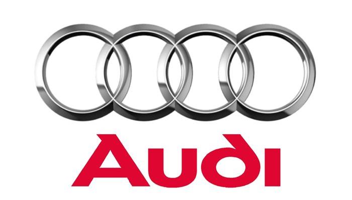
Four hoops…plain and simple, right? Well, wrong. In fact, each of these hoops represent the 4 founding companies of the Auto-Union Consortium way back in 1932: like DKW, Horch, Wanderer and Audi.
3. Coca Cola
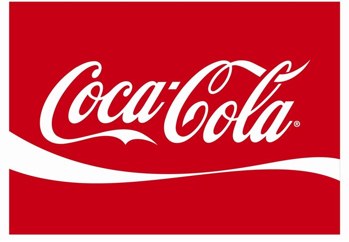
Look closely at the “o.” Do you notice anything? No? Don’t worry because most people wouldn’t notice it. It’s actually the Denmark flag. This wasn’t always the original intention. Coca Cola discovered that part of its logo looks like the Danish flag, which has been named the happiest country on earth. Once they discovered that, they set up a media stunt in Denmark’s biggest airport, where they welcome people with flags. Still can’t see the flag? Here you go:
4. BMW
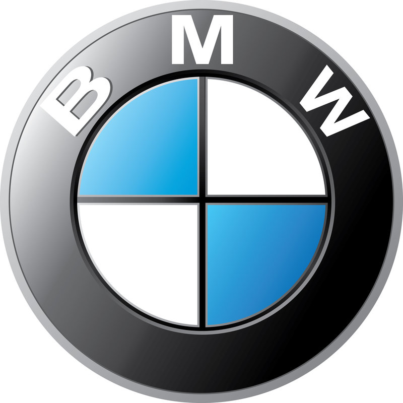
As long as I can remember, the BMW logo has been associated with a blue sky and a propeller spinning, going back to its aircraft-building days. But what if I told you that wasn’t the original intention? According to NYTimes, the trademark was registered in 1917, but the propeller association wasn’t created until a 1929 advertisement where the logo was featured alongside an aircraft. What does it mean then? The colors are blue and white to represent the Bavarian Free State colors. The reason it looks how it does is because using a national symbol in a commercial trademark was illegal, so the colors were arranged in an opposing order. There you have it.
5. Unilever
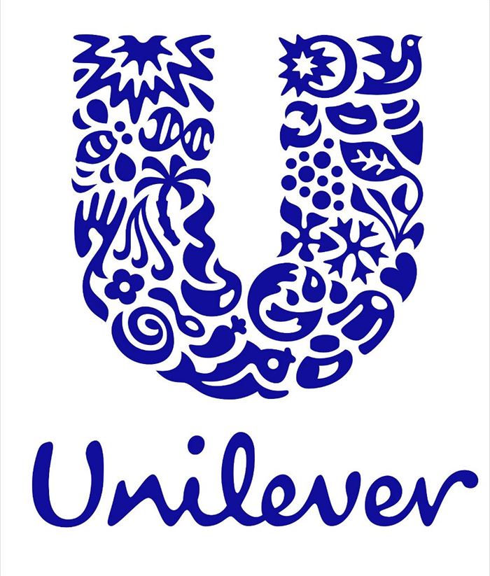
Unilever produces so many different products that sometimes it’s hard to keep track of everything they do. Lucky for us, there’s symbols for literally everything they make right in their logo.
6. IBM
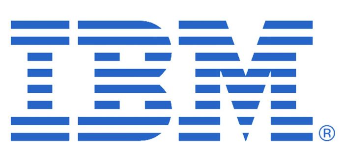
IBM’s logo has a hidden message for the whole world hidden in the Big Blue logo that represents it’s company. The white lines passing through give the appearance of the equal sign in the lower right corner, representing equality.
7. Google
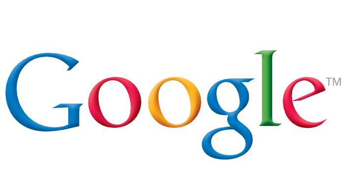
Ever notice how the Google logo has four primary colors in a row then it’s broken by a secondary color? This was entirely intentional. Google wanted to show that they don’t play by the rules and are also playful without making the symbol bulky. To do that, they just used simple letters and colors.
8. McDonald’s
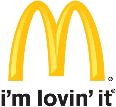
Yes, it really means “M” for McDonald’s and there really isn’t any other meaning McDonald’s had intended. Instead, it came to mean something unintentionally by customers, at least according to design consultant and psychologist Louis Cheskin. In the ’60s, McDonald’s wanted to change their logo but Cheskin insisted on leaving the golden arches. He said it’s because customers unconsciously recognize the logo as “symbolism of a pair of nourishing breasts” . Whether we unconsciously believe this or not, Cheskin convinced them and now the logo is one of the most recognizable in the world.
9. Toyota
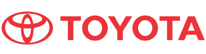
The three ellipses that are found in the logo for Toyota represent three hearts: the heart of the customer, the heart of the product, and the heart of progress in the field of technology.
10. LG
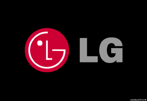
No, the Pac-Man reference is not confirmed, but it’s cool to look at anyways. There is hidden meaning in the LG logo, though. Everyone knows the face, but its position, as well as the “L” and “G,” inside the circle that matters. According to LG, this centers humanity above all else. The circle itself symbolizes the world, future, youth, humanity, and technology while the red represents friendliness. (Hint: a lot of companies use red for this very reason, as it seems to attract consumers a lot.)